— Updated July 6th 2026 —
Markets have their own rhythms — some years sprint ahead, others stumble, and sometimes they swing between euphoria and panic. In this post, I’ve pulled together three visual stories of market behavior: yearly performance rebased for fair comparison, a heatmap that uncovers seasonal patterns month by month, and a look at bull and bear runs that reminds us just how long (and wild) cycles can last. These charts aren’t just numbers — they’re a way to see history in motion and make today’s markets a little easier to understand. In this post, I’ve tried to break down the analysis in a simple and interactive way. I used Python’s Pandas and NumPy to handle the calculations, and brought everything to life with Plotly and Dash to make the charts both beautiful and fun to explore.
It is well known that Plotly, as well as Dash, can be challenging when it comes down to mobile user experience. To that end I’ve put a lot of effort into making the charts user-friendly for mobile users, and to some degree have achieved that; however, I believe there’s still room for improvement. For the optimum user experience, I recommend exploring the charts on a desktop environment.
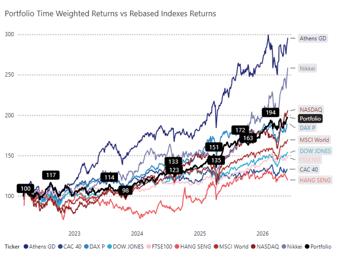
In this analysis, I cover a range of major global equity indexes to provide a broad view of market performance. This includes U.S. benchmarks like the S&P 500, NASDAQ, and Dow Jones; key European indexes such as the STOXX 600, FTSE 100, along with smaller markets such as the Athens General Index; as well as major Asian markets including the Nikkei and Hang Seng, and on a global level, the MSCI World. By looking across these indexes, we can compare market behavior across regions and uncover both global trends and local patterns. My intention is to provide a monthly updated version of this analysis in this post.
Contents
To navigate across different index analyses, use the dropdown menu on the top right-hand side of the chart, as well as the navigation buttons at the top it if needed.

Rebased Daily Return Performance by Year
This chart compares the selected index rebased cumulative return across individual calendar years, allowing a year-over-year comparison of market performance starting from a normalized baseline. This approach isolates the trajectory of returns within each year, enabling meaningful comparisons of how the market evolved during different time periods.
Data Preparation:
- Data: Daily Adjusted Close Prices.
- Grouping: The dataset is grouped by calendar year, and each trading day is assigned a business day counter based on its position within the year.
Daily returns are compounded to create a cumulative return series using:
$$\text{Rebased Performance}_t = \prod_{i=1}^{t} (1 + r_i)$$
where \( r_i \) is the daily return on business day \( i \).
The first trading day of each year is set to a baseline of 1.0 (or 100%) to allow direct comparison across years.
- Non-current years are reindexed to span the full 250 business days for consistency.
- The current year displays performance only up to the latest available trading day.
Visualization Details:
- Each line represents the year-to-date (YTD) performance for a specific year, expressed as total return percentage.
- The best and worst performing years (based on total return at day 250) are highlighted in green and red, respectively.
- The current year’s performance is highlighted distinctly in blue.
- An average performance line is included to provide historical context.
- Final values are annotated to make end-of-year or current YTD performance more interpretable.
Seasonal Returns Analysis Heatmap
This heatmap visualizes the monthly performance of the selected index across multiple years, helping identify seasonal trends and anomalies in equity market behavior. This layout allows for intuitive comparison across both time (years) and seasonality (months), supporting both investor insights and historical analysis.
Data Preparation:
- Data: Daily Adjusted Close Prices.
- Return Calculation: If not already present, daily returns are calculated as:
where \( P_t \) iis the adjusted close price on day \( t \).
- Each row is annotated with its corresponding calendar year and month name.
Monthly Return Computation:
- For each Year–Month combination, a compounded return is calculated by chaining daily returns:
where \( r_t \) is the daily return on business day \( t \) within the month.
This results in a table where:
- Rows represent calendar years.
- Columns represent months (January through December).
- Each cell shows the monthly return in percentage format.
Summary Statistics:
- Yearly Average: The average of all monthly returns within a year.
- Monthly Average: The average return for each month across all years.
Visualization Details:
- The chart uses a three-part subplot layout:
- The main heatmap (top-right) shows monthly returns by year.
- The left heatmap displays each year’s average return.
- The bottom heatmap shows average return per month across years.
- A diverging color scale (RdYlGn) highlights positive (green) and negative (red) performance.
Bull and Bear Market Runs
This chart visualizes distinct bull and bear market phases of the selected index using a dynamic, data-driven approach based on percentage thresholds—commonly used in financial literature and by finance professionals, and provides a clear, historically grounded view of market cycles, emphasizing how long and how strong past bull and bear markets have been. It helps contextualize current market behavior relative to history.
Data:
- Data: Daily Adjusted Close Prices.
Phase Identification:
- Definition:
- A bull market is defined as a price increase of at least +25% from a previous low.
- A bear market is defined as a price decline of at least −25% from a previous high.
- Algorithm:
- The data is scanned chronologically.
- For each phase:
- A local minimum (for bull markets) or maximum (for bear markets) is identified.
- The algorithm then waits for a movement of ±25% from that point to mark the end of the current phase and the start of a new one.
- Each segment between two major inflection points becomes either a bull or bear phase.
Return & Duration Calculations:
- For each phase:
- Start and end dates are recorded.
- Cumulative return is calculated as:
The return is given by \( \left( \frac{\text{End Price}}{\text{Start Price}} - 1 \right) \times 100 \).
- Duration is measured in days and converted to approximate months.
Visualization Details:
- Filled area chart highlights each phase:
- Green for bull markets, red for bear markets.
- The fill represents cumulative returns from the start of each phase.
- Each phase is annotated with:
- Duration in months.
- Total return in percentage.
- A summary annotation at the bottom provides:
- Average return and duration for both bull and bear markets.
- Last updated date.